Showing posts with label Enamel. Show all posts

Monday, July 5, 2021

Watercolour practice

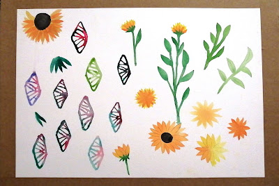
 At the beginning of the semester, I learnt how to paint wet on wet with watercolours and applied it to painting the enamels I made last year for the platinum competition.

I used painting the petals of the sunflowers as dexterity exercises.
Bowes, K., (2021) Enamels and flowers

Thursday, December 17, 2020

Transparent enamel

 After seeing my glazed ceramics I was inspired to work a bit more with my punches to create the feeling of different plants similarly to James' work with her roll milling.  I used these punched pieces to text the transparent enamel for the roll milled leaf texture. Transparent enamel takes longer to fire but there is a fine line between it going transparent and over firing. I was very excited to see that the enamel worked as I have only ever used transparent enamel on etched metal.

Bowes, K., (2020). Punched plant images.


Enamel colours: Top left to right- cactus green, cloisonne blue and unknown blue-green
Bottom left to right- 19A green and Atlantic blue
Bowes, K., (2020). Transparent enamel landscapes

Wednesday, December 16, 2020

Transparent enamel leaf skeleton

Inspired by James’ work I decided to try roll milling my skeleton leaf onto some copper. The detail transferred but not as well as I thought it would. I cut the test into pieces then tested transparent enamel. I expected the enamel to become transparent but most detail would be lost. The cloisonnĂ© blue did exactly as expected but the cactus green colour surprisingly managed to capture all the fine details. I think that is a result of the green being darker.

I feel this method captures the texture of the leaf better than the opaque enamel leaf stencil. The transparent enamel makes it look as if it is a leaf trapped in a glass layer. Whereas the opaque enamel looks more like an illustration of the leaf.


Bowes, K., (2020) Skeleton leaf roll milled.
Bowes, K., (2020). Transparent cloisonne blue enamel
Bowes, K., (2020). Cactus green transparent enamel

Wednesday, September 30, 2020

Organic Magnification

As I have been finishing off my semester report I noticed something about all my unfinished pieces. I am looking at growth, mostly in plants, from three different magnifications: the plant as a whole, segments of the plant and the cellular structure. Growth happens at different levels, it starts with cells that together make up the tissue(leaves), those tissues create an organism (the plant). 

So far in my work, I have used different techniques to display each stage, I cast whole succulents, used leaf skeletons as enamel stencils and in my platinum piece pierced out patterns that resemble cells. I want to continue with enamelling, casting and piercing but I don't want to restrict each stage of magnification to a single technique.

I am not focusing on one particular plant as different plant work better for different processes, for example, succulent leaves can't be made into skeletons but they have a perfect thickness for casting but the flaming glorybower leaves are the only leaves I have found to work when making the skeleton leaves. 


Biological diagram of a leaf
https://o.quizlet.com/zIlVHfngIiKm0zPje6Lojw_b.jpg 

Monday, August 17, 2020

Neat edges

To neaten up the edges I was going to enamel the edges, but it is a risk as I could easily over fire the top. To enamel the edges, I also cannot enamel where the claws are, as when I put pressure on the claws to set the enamel cracks, and the edge enamel could crack the top.

 Lihle works with gel nail polish, and she suggested using some of her gel on the edges as it looks like enamel, but it does not require heat to set, it sets with a UV lamp. Therefore, I can set the enamel and then paint the gel with a very fine brush that is used for painting designs with gel nail polish on nails.

Figure 1-Bowes, K., (2020). Enamel with copper edge.

Figure 2-Bowes, K., (2020). gel brush and gel on a nail.

Figure 3- Bowes, K., (2020). Set enamel with gel edges.


Thursday, July 30, 2020

Enamels

I did an enamel piece to go with my platinum but I ended up accidentally chipping it in 3 places and I just really wasn't happy with it at all so I decided to enamel a few more pieces and maybe try other colours.

My first 3 were disasters, looking at figure 1 from left to right my first one for some reason became narrow I think this was from trying to get the enamelling tripod to hold the piece but it ended up squashing it. The second one I tried a different green but the red did not fire into the green, as nicely. I also wanted to try the red on a dark colour like blue but as the red cooled and became brighter after enamelling all I could see was Spiderman colours and I cannot unsee it.
Figure 1 -Bowes, K., (2020). First 3 enamels.

I decided to stick with the blue-green I was originally working with as I have fallen in love with how the two enamel colours complement each other. I did 3 variations of the placement of the red enamel. I am going to work with the enamel on the far right of figure 2.

Figure 2 -Bowes, K., (2020). My second set of enamels.
 

Wednesday, July 22, 2020

Third Prototype

I melted my first 2 prototypes and started from scratch. 
The first change I made was that I focused my flame towards the centre when I melted the pattern in the silver to try to prevent bubbling near the claws. I was also advised that the claws broke due to the crystal structure of the metal changing due to the intense heat of melting so I followed the advice of hammering the claws to compress the crystal structure and then annealing the claws so they could bend easily without breaking. I am glad to say that it worked, and the claws stayed intact, as seen in figure 1. 

In the first prototypes, I tried to wrap the wire around the melted pattern, but I struggled, and the brooch wire kept kinking. I changed the way I attached the pin, so the wire didn't kink and looks more discreet from the front. My brooch pin was also flat in the first test which isn't right as I forgot to accommodate for fabric, so I took that into consideration in this prototype (Fig. 2).

Figure 1 - Bowes, K., (2020). the front of the brooch.

Figure 2 -Bowes, K., (2020). the back of the brooch.


Sunday, July 19, 2020

Claws

I continued the pattern from the copper (Fig.1) to cut claws that will hold the enamelled copper (Fig.2). I am not sure how the claws would look set though so I bent up the claws to see how it would look. I think the claws are a bit too large and need to fit in more with the enamel pattern. I used Art flow to draw on a photo of the enamel piece as to where claws would be placed to fit with the pattern, as seen in figure 3. This means the claws will be small and will not so overpower the enamel.

Figure 1- Bowes, K., (2020).extending the pattern.
Figure 2-Bowes, K., (2020). cut claws.

Figure 3- Bowes, K., (2020). digital drawing of claws.

Wednesday, July 15, 2020

casting or no casting?

After I chose my shape, I could not get past the idea of the pattern on the setting being flat and boring. I was thinking of incorporating one of my cast succulents into the setting to add some form under the enamel dome. I tested what it would look like with some test pieces and I think it might work (Fig.1).

The only thing is with using this idea for platinum is that I cannot enamel on or cast in platinum which means casting the succulent in silver but then only the setting would be in platinum. My sketches are not accurate as I realized I will not have enough platinum to make the setting very big so that the succulent is only in the one corner as seen in figure 2.  The succulent will take away from how much platinum is visible between the enamel if I make the setting smaller. 
Figure 1-Bowes, K., (2020).  test pieces.


Figure 2- Bowes, K., (2020). Quick sketches.

Tuesday, June 30, 2020

Setting the enamels

I set one half and was actually reluctant to set the other side as I really liked the look of the dome from the bottom (Fig. 2) but I still wanted to see if I could set two enamels so I took some photos and continued to set the other side.
Figure 1- Bowes, K., (2020). After setting.

Figure 2- Bowes, K., (2020). The bottom

I managed to set the second dome using my left hand as my 'peg' to push against while setting with my right hand. It was very uncomfortable at first, but I eventually got the hang of it. I had sanded the claws on the inside, making the metal thinner for setting which made it slightly easier to set. The claws on the edge of the enamels look like a spine, which I find to be very interesting. This distinct shape is probably because my claws are closer together than Nora Kovat's claws are in her setting.
Figure 3-Bowes, K., (2020). Top view. 

Figure 4- Bowes, K., (2020). Side view, claws.

I think this has a lot of promise to lead to other designs. I do not think the double-sided enamel setting would work for a brooch, but it could easily work for a pendant or earrings. If I only put the enamel on one side, I can use this setting for a brooch as well as pendants, earrings etc. I plan on exploring this further and using this technique to make jewellery.

Setting for enamels

I wanted to set my two enamel pieces but didn't know how to go about it until I saw this photo by  Kovats, she uses a piece of metal between her two enamel pieces that has claws in either direction to secure both sides to one middle piece, as seen in figure 1. I thought I would try to set my enamels in the same way but I knew it was going to be difficult as putting too much pressure on enamel can crack it so once the one side is set setting the other side would be a challenge.
Figure 1-  Kovats, N., (2020) Enamel pendant.


I used the same pattern the was used on the domes on the setting plate, but I reduced it and used different sections. I reduced the pattern as the gaps on the domes were large so it would add some contrast also because I did not want the plate to become too flimsy and bends as I set. For the claws, I cut slits bent half up and half down then shaped and sanded them as seen in figure 3. 
Figure 2- Bowes, K., (2020). Pierced pattern on the setting
.
Figure 3- Bowes, K., (2020). Claws. separated 

Thursday, June 25, 2020

Enamel experiment

I decided to try using my abstract pattern page to create some enamelled domes. I first made a mistake of piercing out the pattern and then doming it which just distorted the shape and broke a section off, so I started again making sure to dome first. 

I love the contrast on the leaves of the Garden Croton plant I have growing at home so I decided to use that for my colour pallet for the enamel. The plant is not indigenous so I don't see them very often. The lady who owned the house before us put a lot of effort into her garden before we made many changes this was one of the few plants we left where she planted so there is colour in the garden.
I chose to use a deep green and red to imitate the contrast on the dark leaves and the colours are complementary. The green enamel appeared bluer on the lid test piece but when I fired it it came out green which is what I wanted.
My Garden Croton
Green and red enamel

I'm not sure if the green is a hard enamel but I do know that the red is a soft enamel. I tried layering the enamels both ways green on red and red on green (test pieces are at my bench I will insert a picture). The green sat on top of the red making it thick and look terrible but the red blended on top of the green making it smooth and speckled in some areas as if the two colours were applied at the same time. The leaves also have a speckled effect so I prefer the red on the green enamel.
The final domes after enamelling


Wednesday, June 24, 2020

Abstract pattern

This was another doodle page I did during the lockdown and between the three I enjoyed drawing this one the most and this page was purely for enjoyment. I feel there is more variety of shapes and size compared to the triangle and bubble doodle pages. It reminds me of the nervous system program once the grid has been manipulated but it's not all circles and looking at the positive and negative shapes it also sort of resembles the venation patterns found in insect wings but with thicker lines between the segments. 

I wasn't sure what I was going to do with the pattern so I photocopied it and sectioned off small parts of which I then coloured with pencil crayons thus making the positive and negative spacing clearer. I used different colours as I was planning on choosing a colour to colour the entire A3 page, just for fun, but ended up forgetting about it entirely until I saw the page with the coloured circles last week and realized they looked almost like abstract enamel discs which could be interesting.

Coloured segments
A3 doodle page

Wednesday, April 8, 2020

Colour theory - colour combinations

 The colour wheel can be split in many different ways to create colour combinations that are harmonious and pleasing to the eye.
The colour wheel can be split in half with half the colours being warm colours and the other half is cool colours. Warm colours include red, orange and yellow and cool colours are blue and green (including all their tones, shades tints and tertiary colours). Purple can be a grey area as it is a combination of red and blue which is both warm and cool. Purple's tertiary colours, on the other hand, are definitely divided blue-purple is cool and red-purple is warm. According to the site where I took my images from purple is in cool colours.
cool and warm colours
https://99designs.com/blog/tips/the-7-step-guide-to-understanding-color-theory/

The colour wheel can also be split into 3 colour schemes:
Complementary colours- these colours are directly opposite one another on the colour wheel these colours contrast one another and pop when used together, for example blue and orange.
Split complementary- it is the same as complimentary but it is a hue and instead of the hue on the opposite side of the colour wheel it's the two colours on either side of the complementary colour for example complementary colours would be blue and orange but split complementary would be blue, red-orange and yellow-orange.
Analogous colours- are three colours that are right next to each other on the colour wheel, for example blue, blue-green and green.
Triadic colours- these are three colours that are evenly spaced out on the colour wheel and are bright together, for example blue, red and yellow.
Monochromatic- this consists of a hue, a shade of the hue and a tint of the same hue.
colour schemes
https://99designs.com/blog/tips/the-7-step-guide-to-understanding-color-theory/


Colour theory - colour wheel

Colour theory is important when enamelling as combining colours need to be carefully considered.
There are three main colours which make up all the colours we see these three colours are called primary colours: red, blue and yellow. When these colours are mixed in different combinations they make three new colours called secondary colours: red + blue = purple, red + yellow = orange, blue + yellow = green. Mixing primary and secondary colours create six new colour combinations which are tertiary colours.
All these colours are usually depicted in a circle called a colour wheel. it is composed of the primary colours with the secondary colours between the colours primary colours that make them. The tertiary colours are between the primary and secondary colours which make them. For example purple will be between red and blue on either side of the purple will be tertiary colours so between blue and purple will be blue-purple.

primary, secondary and tertiary colours
https://99designs.com/blog/tips/the-7-step-guide-to-understanding-color-theory/

Light is what determines the colours we see, light splits into seven colours Red, Orange, Yellow, Green, Blue, Indigo and Violet. Light hits an object and is reflected off the object and that is how we see different colours and due to this black and white aren't colours. Black is the absence of light and white is all the colours combined which are just the reflection of light. But when mixing colours adding black creates shades of the base colour, also called a hue, adding white to the hue creates tints and adding grey creates tones this is how we have many variations of all the basic hues.
hue, shade, tint and tone
https://99designs.com/blog/tips/the-7-step-guide-to-understanding-color-theory/


Thursday, March 19, 2020

A 'nice' piece

For our first brief is to  "Make a piece (of jewellery?) that incorporates a 'nice' looking object that you made."  Which when it was discussed in class it was put in terms of making something nice and incorporate it into something else. The question is what do we think is nice and what will we incorporate it into?

We also discussed developing our craft skills during our advanced diploma so this got me thinking of incorporating some of my enamelled pieces into some embroidery. I started with the enamelling and stencils first so that if the embroidery part doesn't work then I will still have enamelled pieces I can work with. I also want to cast a few more succulents and enamel on those as well what I will incorporate that into yet I have no idea.

 Woolnough, M. embroidered Autumn leaf
https://mamabee.com/20-stunning-embroidered-leaves-that-look-like-the-real-thing/


Friday, March 13, 2020

Stencil?


I really enjoyed piercing this pattern out. One of the small sections broke though, as the metal is thin and I dropped my saw frame with the blade and piece still attached.
I'm not sure what I am going to do with it yet, I am thinking if I should enamel it or use it as a stencil. So because I can't make my mind up I decided to pierce another one. 

Wednesday, March 11, 2020

Experimenting (descriptive writing)

I wanted to work with the positive and negative shapes of the leaf veins as I wanted to continue with my enamelling. I took a square piece of copper plate and rolled it so that it was about cardboard thin. I then put the copper onto my soldering block and used my soldering torch to melt small holes into the plate. It was interesting to see the copper melt and gather making blobs around the holes. The problem was that it is difficult to control how big the hole will turn out. The copper plate looked abstract once I was done melting holes so I decided to enamel it with jade green to hopefully make the holes look more like the bite marks from an insect on a leaf (Fig. 1). But after enamelling, it looked worse. The green square looked like it was a piece of mouldy cheese out of a cartoon. The square shape and the shiny finish from the enamel enhanced the look of it being artificial cheese. I couldn't get the cheese image out of my head so I scraped the idea.

Trying to salvage my idea of working with positive and negative shapes I took my leaf skeleton and photocopied it. I then increased the image of the leaf until the small fragile veins were visible. I drew over the photocopy so it was not so faded as I wanted to insert the image into Rhinocerous (our CAD program). I drew a section of the pattern on Rhino which I then printed and started piercing it out of copper which can be seen in figure 2. The pattern is so much cleaner and neater than my first method and once it is done I will decide if I am going to enamel on it or not.
Figure 2 - Rhino drawing and piercing 
Figure 1- Jade green enamel before firing


Thursday, February 27, 2020

Nora Kovats

Nora Kovats is a contemporary jewellery designer and illustrator from South Africa that is now based in Berlin. She works with silver and vitreous enamel.  Nora Kovats uses botanical imagery in her pieces. She refers to her garden as an inspiration even though her mythical garden in her jewellery may not always reflect her physical garden. She uses the botanical illustrations of her garden as a surface to sieve enamels over while also using her illustrations to inspire the colours she uses in her enamelling process.
 Kovats.N.(n.d.) enamelling over illustrations

Her pieces are interesting as they are simple pierced pieces of metal that have been enamelled. Some of the pieces are domed and strung with beads or stones. She has different variations of the same techniques which are due to the fact that she chooses to create multiple pieces of jewellery at the same time. She states that this is because "it’s a creative process in several disciplines simultaneously."(Kovats,2020)

Kovats.N. (2017-18).Deep Sea Garden Monsters.Neckpiece, enamel and beads 


Wednesday, February 19, 2020

Opaque enamel with stencil

I redid my leaf skeleton stencil work but I used flat copper pieces and added backing enamel for support. The details came out so much better but I think this is also due to the change in enamel colours that I used to create contrast. Figure 1, I used light and dark green which is almost an exact match of colour to the leaf when it is being cleaned. I used a light green and blue enamel on the second one (Fig 2) to try something different but still keeping the contrast.

Figure 1- Green layered enamel

Figure 2 - Blue and green layered enamel